Sometimes, when you’re looking for a quick answer, it’s really useful to have an FAQ system in place, rather than waiting for someone to respond to a question. Wouldn’t it be great if Slack could just answer these FAQs for us? In this tutorial, we’re going to be making just that: a slash command for …
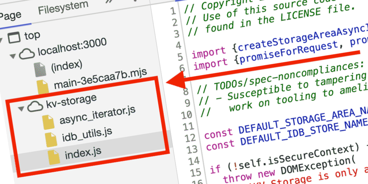
In back-end development, storage is a common part of the job. Application data is stored in databases, files in object storage, transient data in caches… there are seemingly endless possibilities for storing any sort of data. But data storage isn’t limited only to the back end. The front end (the browser) is equipped with many …
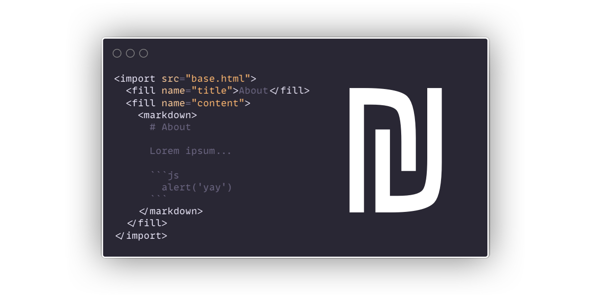
This is a neat little HTML preprocessor from Giuseppe Gurgone. It has very few features, but one of them is HTML includes, which is something I continue to be baffled that HTML doesn’t support natively. There are loads of ways to handle it. I think it’s silly that it’s been consistently needed for decades and …
The topical idea of “how to think like a front-end developer” began for me as a series of podcast interviews on ShopTalk Show. That was in preparation for a talk I was preparing (and gave) of the same name. That talk evolved into my essay The Great Divide, which evolved into the essay The Widening …
A look at using HTML preprocessors to generate HTML, particularly deeply nested HTML, which is useful for a variety of interesting browser art and experimentation.
Last year’s State of CSS Survey yielded interesting results. There’s the quick adoption of features, like calc() and CSS custom properties. There’s also the overwhelming opinion that CSS is fun to write even as we see a growing reliance on CSS-in JS. We also saw some predictable results, like the proliferation of VS Code as …
Looks like the word “durable” is an emerging term in the world of serverless. As I understand it, it’s like allowing for state in places you wouldn’t normally expect to have it. For example, you call some cloud function and run some JavaScript… unless you have it go get some data from elsewhere, it has …
A little while back we shared the news that WooCommerce shipped a beta payments feature as part of its 4.0 release. It’s a free plugin with no monthly costs or setup fees. You only pay when you make a sale. We’re actually using this right here at CSS-Tricks. In fact, Chris blogged it back in …
Lea has some words: Perusing the components on webcomponents.org fills me with anxiety, and I’m perfectly comfortable writing JS — I write JS for a living! What hope do those who can’t write JS have? Using a custom element from the directory often needs to be preceded by a ritual of npm flugelhorn, import clownshoes, build quux, …
A grouping of hand-selected posts from our site about Web Components. We’ve published a very useful article series from Caleb Williams, so that’s here, but also sprinkled in some other informational and link posts on the subject.
Over on Smashing, Adebiyi Adedotun Lukman covers all these styling methods. It’s in the context of Next.js, which is somewhat important as Next.js has some specific ways you work with these tools, is React and, thus, is a components-based architecture. But the styling methods talked about transcend Next.js, and can apply broadly to lots of …
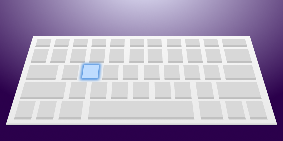
Many forms of assistive technology use keyboard navigation to understand and take action on screen content. One way of navigating is via the Tab key. You may already be familiar with this way of navigating if you use it to quickly jump from input to input on a form without having to reach for your …
Always worth repeating: all interactive elements should have a focus style. That way, a keyboard user can tell when they have moved focus to that element. But if you use :focus alone for this, it has a side effect that a lot of people don’t like. It means that when you click (with a mouse) …
Just the other day, Jeremy Keith wrote that problems with performance work isn’t only a matter of optimization and fixing code, but also tackling people problems: It struck me that there’s a continuum of performance challenges. On one end of the continuum, you’ve got technical issues. These can be solved with technical solutions. On the …
We’ve covered techniques before for when you want a full-width element within a constrained-width column, like an edge-to-edge image within a narrower column of text. There are loads of techniques. Perhaps my favorite is this little utility class:
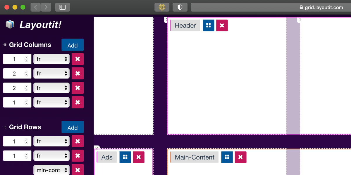
Layoutit Grid is an interactive open source CSS Grid generator. It lets you draw your designs and see the code as you go. You can interact with the code, add or remove track lines and drag them around to change the sizing — and you get to see the CSS and HTML change in real …
Before we delve into making a realistic motion blur in CSS, it’s worth doing a quick dive into what motion blur is, so we can have a better idea of what we’re trying to reproduce. Have you ever taken a photo of something moving quickly, especially under low light, and it turned into a blurry …
Authentication is one of the most challenging tasks for developers just starting with GraphQL. There are a lot of technical considerations, including what ORM would be easy to set up, how to generate secure tokens and hash passwords, and even what HTTP library to use and how to use it. In this article, we’ll focus …
Some very cool news from Netlify: Edge Handlers are in Early Access (request it here). I think these couple of lines of code do a great job in explaining what an Edge Handler is: So that’s a little bitty bit of JavaScript that runs at “the edge” (at the CDN level) for every request through …
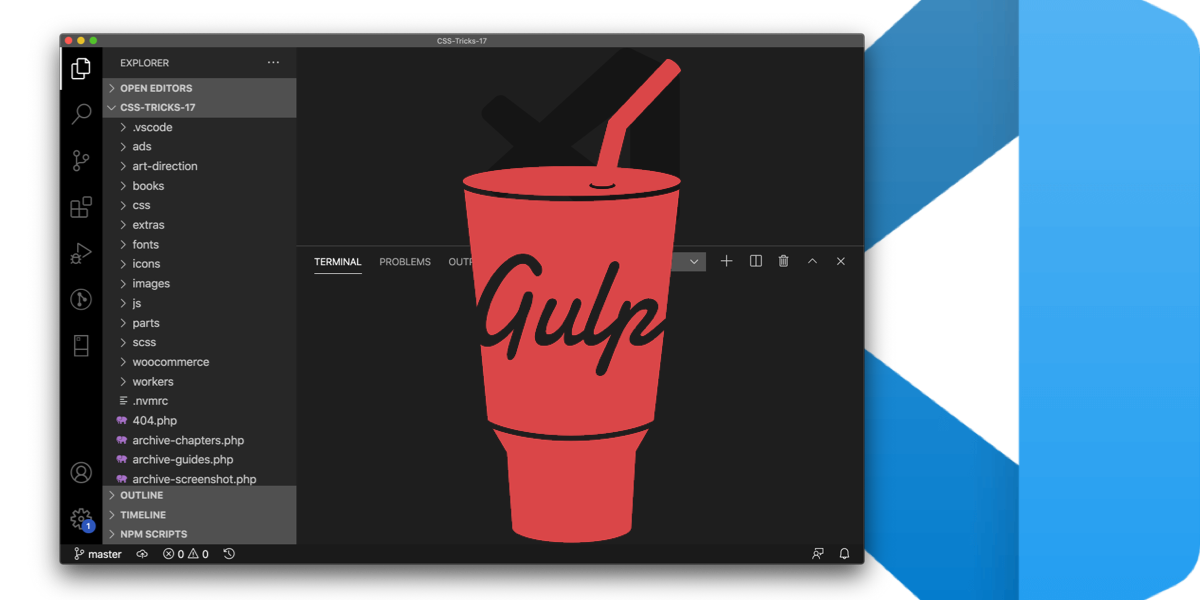
When I open my local project for this very site, there is a 100% chance that I need to run this command before anything else: gulp. I set that up fresh less than a year ago so I’m on the latest-and-greatest stuff and have my workflow just how I like it. I did a few …
When I first discovered Material Design, I was particularly inspired by its button component. It uses a ripple effect to give users feedback in a simple, elegant way. How does this effect work? Material Design’s buttons don’t just sport a neat ripple animation, but the animation also changes position depending on where each button is …
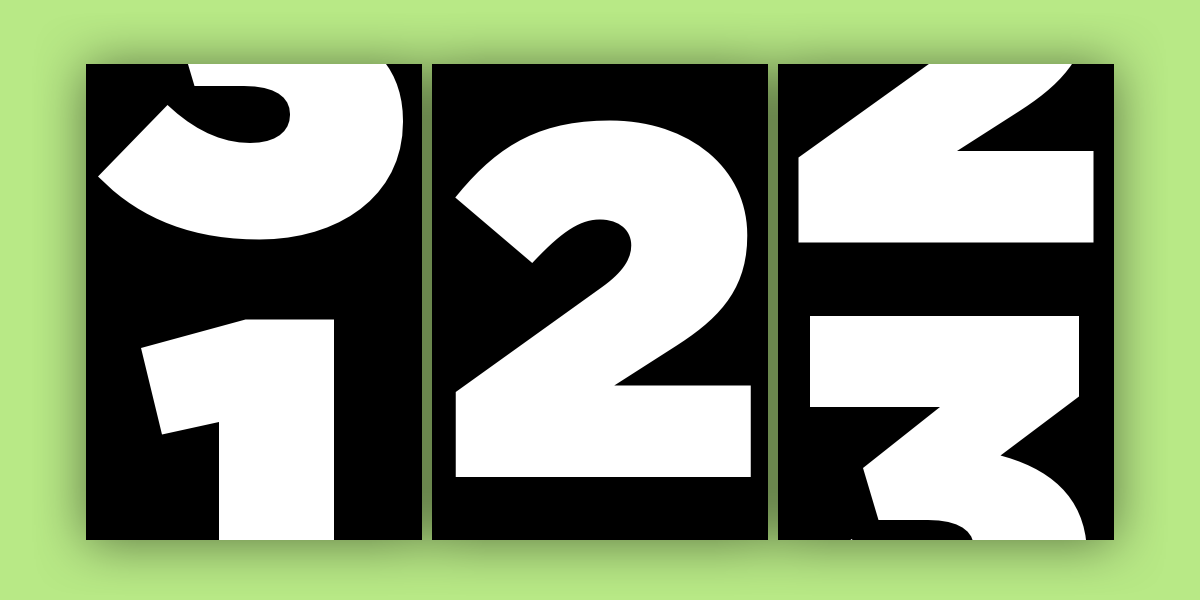
Number animation, as in, imagine a number changing from 1 to 2, then 2 to 3, then 3 to 4, etc. over a specified time. Like a counter, except controlled by the same kind of animation that we use for other design animation on the web. This could be useful when designing something like a …
Let me show you a way I recently discovered to center a bunch of elements around what I call the pivot. I promise you that funky HTML is out of the question and you won’t need to know any bleeding-edge CSS to get the job done. I’m big on word games, so I recently re-imagined …
This is an extended version of my essay “When front-end means full-stack” which was published in the wonderful Increment magazine put out by Stripe. It’s also something of an evolution of a couple other of my essays, “The Great Divide” and “Ooops, I guess we’re full-stack developers now.”
AWS Amplify is a collection of tools from AWS to help you build applications. Allow me to set the stage here to try to make that as clear as I know how. I have a friend (true story) who wants to build an app centered around physical training. His wife is a physical trainer, and …
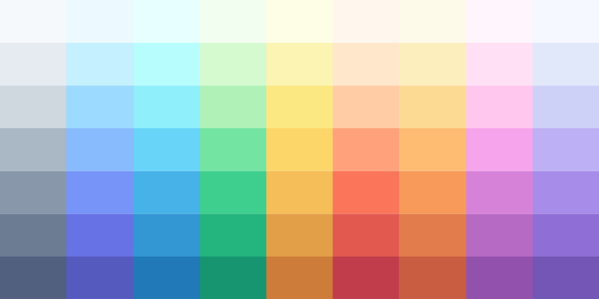
Lately I’ve been taking a look into designing with color (or “colour” as we spell it where I’m from in New Zealand). Looking at Adam Wathan and Steve Schroger’s advice on the subject, we find that we’re going to need more than just five nice looking hex codes from a color palette generator when building …
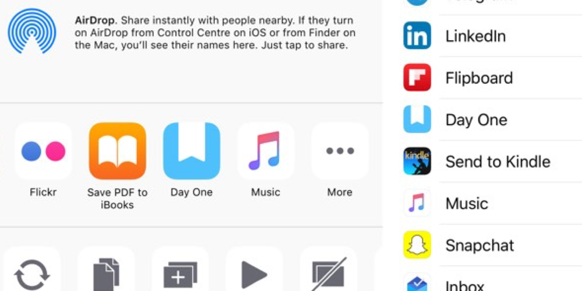
I think the Web Share API is very cool (here’s our coverage). In a nutshell, it taps into the native sharing features on whatever platform you’re on, if that platform supports it.
Danielle Romo covers the HTML pattern you need when you have a wordy <label> with fancy styling for an <input type=”radio”>. The trick? The ol’ <span class=”hidden-visually”> that contains the label that you want to be read, and a <span aria-hidden=”true”> with the visual-only content.
A button to return to the top of the page allows the user to quickly return to the top of the page without making too much effort. This can be very useful when the page has a lot of content or which happens, for example, on one page websites, when infinite scrolling is used, or …
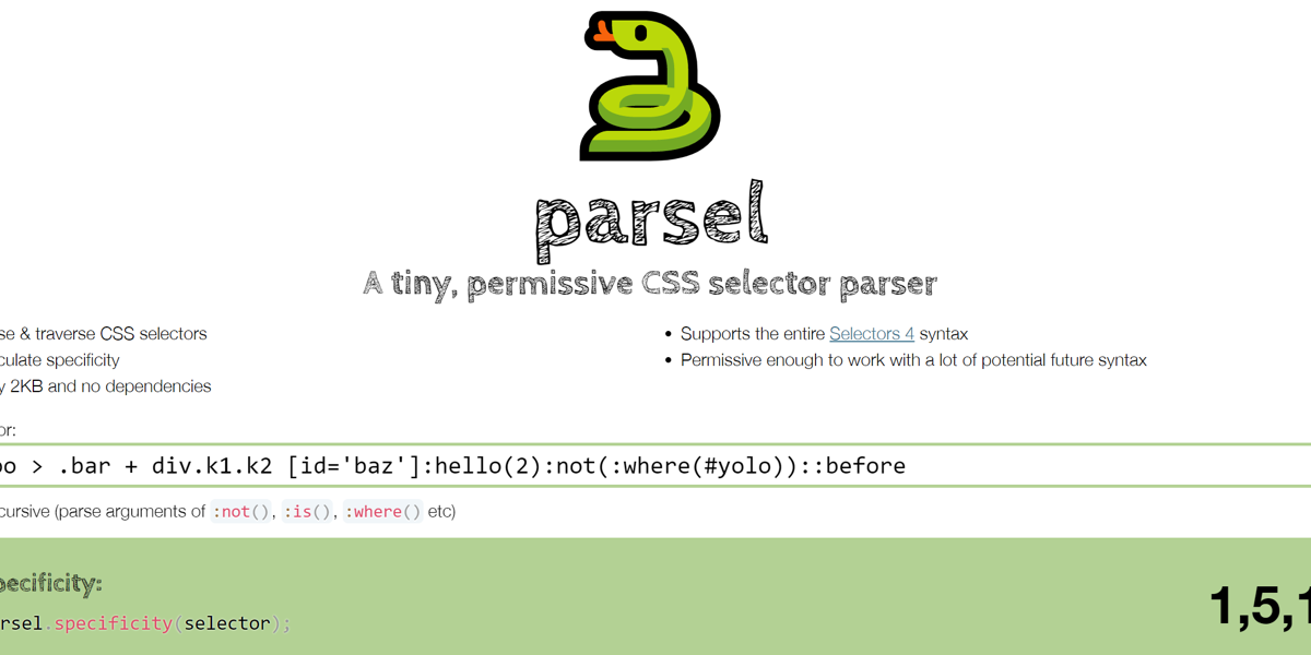
If you’ve ever thought to yourself, gosh, self, I wish I could have an Abstract Syntax Tree (AST) of this CSS selector, Lea has your back. If you’ve ever thought that same thing for an entire CSS file, that’s what PostCSS is, which has gone v8. PostCSS doesn’t do anything by itself, remember. It just …

 css-tricks.com