In nature, no two things are ever the same. Life is imperfect, unpredictable, and beautiful. We can walk through the same forest every day and see differently colored leaves. We can look up at the clouds every minute and watch a whole new formation. The physical world is transient and ever-changing. What if our designs …
What is one thing people can do to make their website better? Exactly what you want to build! Ask yourself: What drew you to development in the beginning? Is there an experimental API that you’ve been wanting to try out? What could you spend all night hacking away at, just for the fun of it? …
I was playing this game on Apple Arcade the other day called wurdweb. It’s a fun little game! Little touches like the little shape dudes that walk around the screen (but otherwise don’t do anything) give it a lot of character. I kinda want little shape dudes that walk around on websites. But another UI …
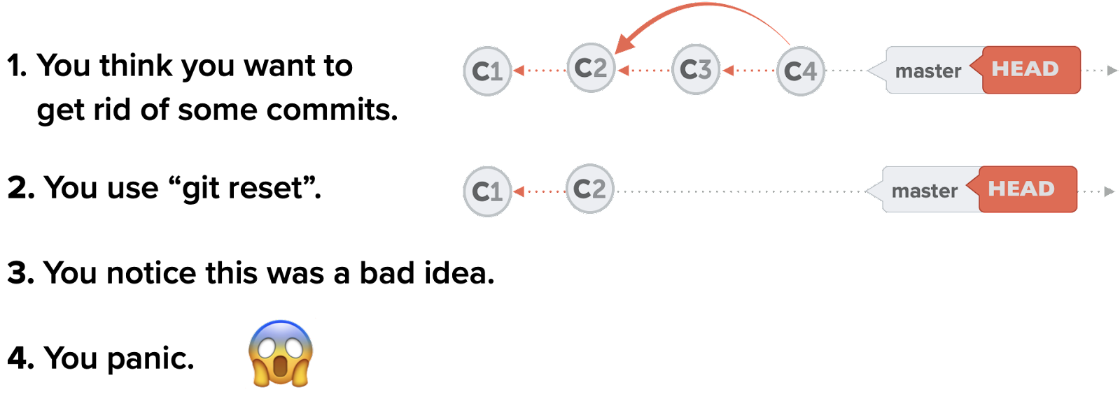
This article is part of our “Advanced Git” series. Be sure to follow us on Twitter or sign up for our newsletter to hear about future articles! The “Reflog” is one of Git’s lesser-known features—but one that can be extremely helpful. Some people refer to it as a “safety net,” while I like to think …
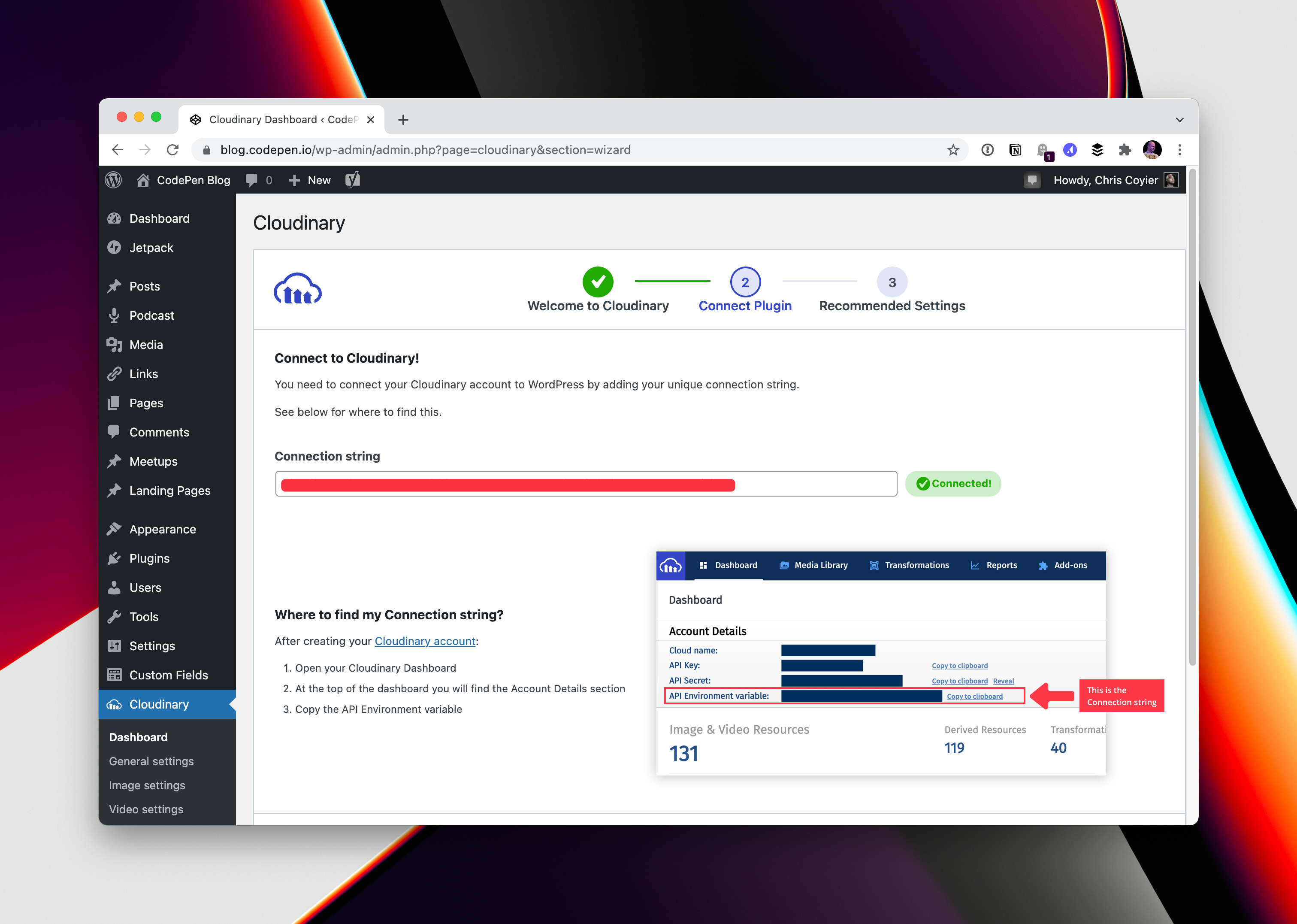
Cloudinary (the media hosting and optimization service) has a brand new version (v3) of its WordPress plugin that has really nailed it. First, a high-level look at the biggest things this plugin does: It takes over your media handling. Images and video are served by Cloudinary instead of your own server, which is good for …
Apple Music has this “Spatial Audio” feature where the direction of the music in your headphones is based on the location of the device. It’s tough to explain just how neat it is. But that’s not what I’m here to talk about. I opened up the Apple Music app and saw a featured playlist of …
This is a neat idea for a research project. The big map is fun, but the research had some tidbits in it worth looking at. The average favicon network request takes 130ms, at least from our speedy cloud instance. Fast, but not that fast, particularly for a file that nearly every website in the world …
I’ve got some blind spots in CSS-related performance things. One example is the will-change property. It’s a good name. You’re telling the browser some particular property (or the scroll-position or content) uh, will, change: But is that important to do? I don’t know. The point, as I understand it, is that it will kick .el …
I love little touches that make a website feel like more than just a static document. What if web content wouldn’t just “appear” when a page loaded, but instead popped, slid, faded, or spun into place? It might be a stretch to say that movements like this are always useful, though in some cases they …
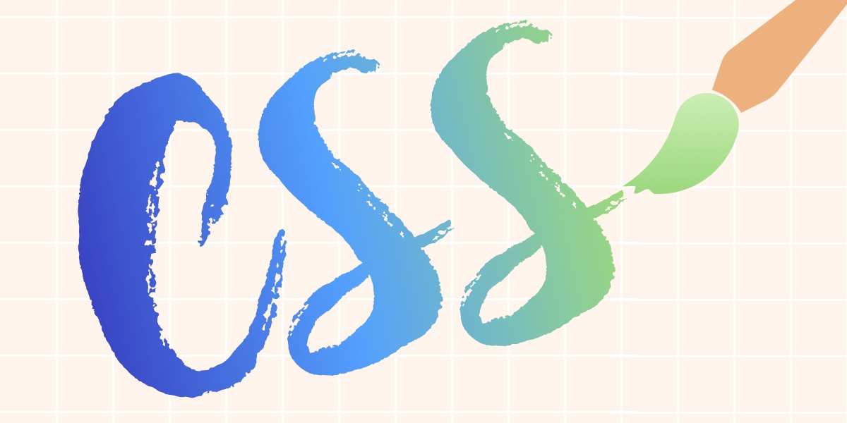
The browser has long been a medium for art and design. From Lynn Fisher’s joyful A Single Div creations to Diana Smith’s staggeringly detailed CSS paintings, wildly creative, highly skilled developers have — over the years — continuously pushed web technologies to their limits and crafted innovative, inspiring visuals. CSS, however, has never really had …
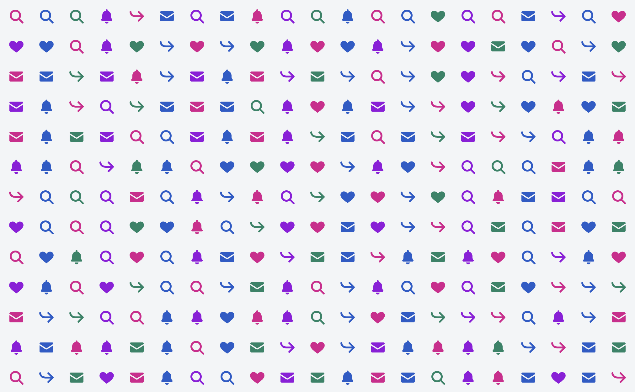
Tyler Sticka digs in here in the best possible way: by making a test page and literally measuring performance. Maybe 1,000 icons is a little bit of an edge case, but hey, 250 rows of data with four icons in each gets you there. Tyler covers the nuances carefully in the post. The different techniques …
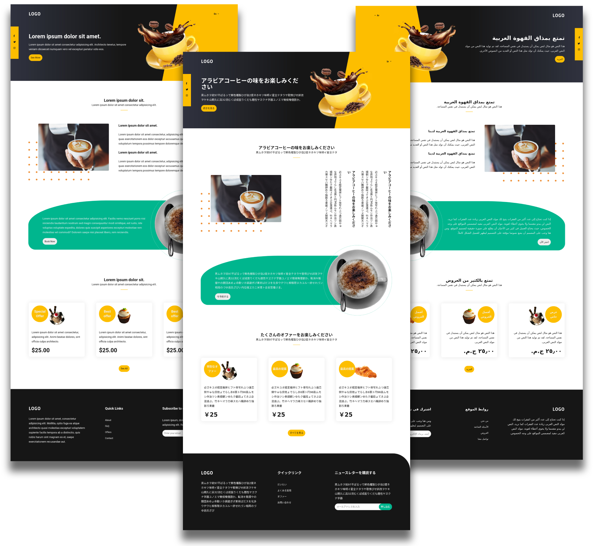
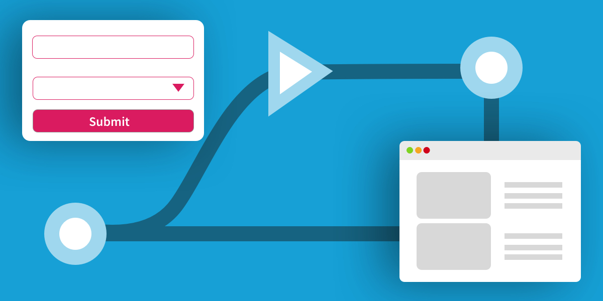
Many business websites need a multilingual setup. As with anything development-related, implementing one in an easy, efficient, and maintainable way is desirable. Designing and developing to be ready for multiple languages, whether it happens right at launch or is expected to happen at any point in the future, is smart. Changing the language and content …
Inspired by Eva PenzeyMoog’s new book, Jeremy highlights the widespread user tracking situation in this industry: There was a line that really stood out to me: The idea that it’s alright to do whatever unethical thing is currently the industry norm is widespread in tech, and dangerous. It stood out to me because I had been thinking …
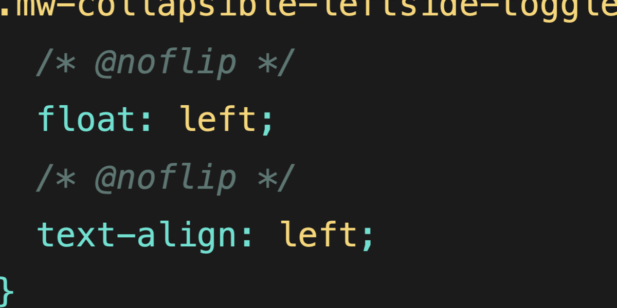
A reader wrote to me the other day asking about this bit of CSS they came across in Wikipedia’s Common.css: What’s that @noflip business? That’s what they are calling a “CSS decorator” and I think that’s a fine term for it. Really they are just CSS comments, but clearly there is more going on here as …
We cannot talk about web development without talking about Responsive Design. It’s just a given these days and has been for many years. Media queries are a part of Responsive Design and they aren’t going anywhere. Since the introduction of media queries (literally decades ago), CSS has evolved to the points that there are a …
Koji su tagovi za grupisanje sadržaja? Često je potrebno grupisati delove sadržaja strane da bi mogao da se razlikuje od drugih delova (npr. meni, sadržaj, artikal…) i da bi mogli da mu definišemo specifičnu veličinu kao i poziciju na stranici kroz CSS. Grupisanje se jednostavno vrši tako što se u sadržaj smešta u okviru odgovarajućeg …
Tag za naslove <h1> do <h6> Unutar ovih tagova se stavljaju nazivi naslova. Najveći (najglavniji) naslov se obeležava sa <h1> dok se najmanji naslov obeležava sa <h6> tagom. See the Pen Naslovi u html-u by Web programiranje (@chos) on CodePen. Paragraf tag<p> Ovaj tag se koristi da smestimo unutar njega obični tekst koji je standardne veličine i …
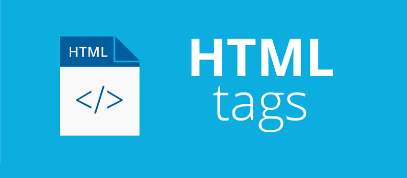
Šta je HTML? HTML (Hypertext Markup Language) je deskriptivni jezik za označavanje specifičnih delova sadržaja web stranice (tzv. markup jezik). Ko koristi ove oznake sadržaja? Ove oznake sadržaja koriste browseri, jer tek kad “vide” odgovarajuću html oznaku oni znaju koji je tip sadržaja u pitanju (da li je slika ili tekst…) i šta treba da urade …
I’m not the biggest fan of Atomic CSS myself. I don’t like all the classes. I like to express my styles in CSS because I find CSS… good. But I appreciate that a lot of people seem to like it, and it does have some clear advantages, like the fact that the generated stylesheet is …
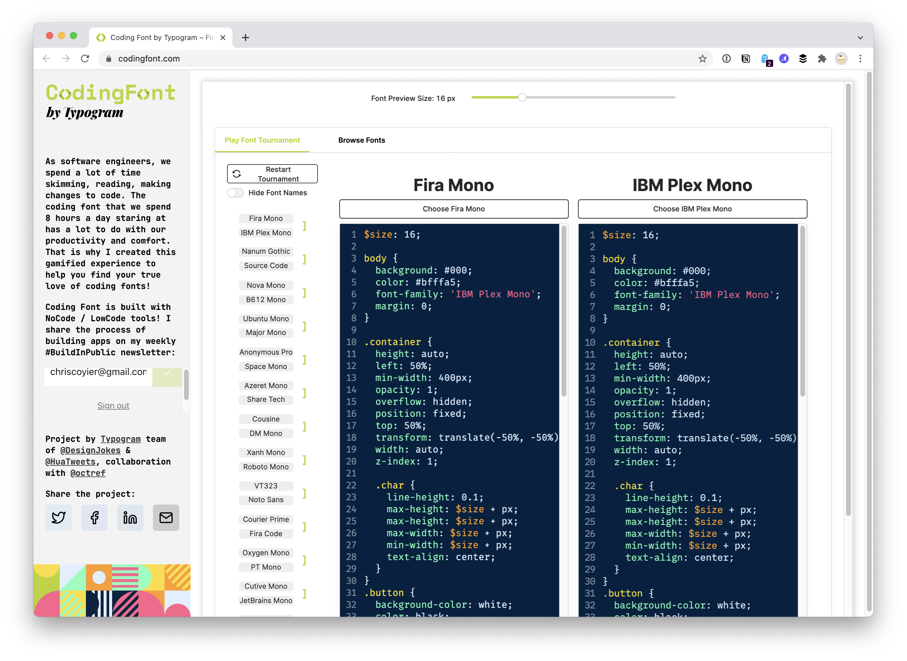
A tournament bracket UI where you pick your favorite between two coding fonts and your choices are whittled down all the way to a final winner. A clever way to suss out your own taste and arrive at a choice.
Good friend Kent C. Dodds has recently dropped his new website which had a lot of work go into it. I was fortunate enough that Kent reached out a while back and asked if I could come up with some “whimsy” for the site. ✨ One of the first things that drew my attention was …
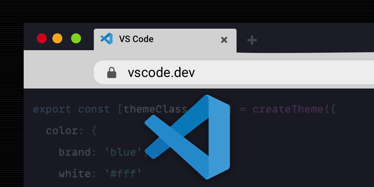
VS Code is built from web technologies (HTML, CSS, and JavaScript), but dare I say today it’s mostly used a local app that’s installed on your machine. That’s starting to shift, though, as there has been an absolute explosion of places VS Code is becoming available to use on the web. I’d say it’s kind …
Dealing with dates and times is one of those things that can frustrate programmers a lot. At the same time, they are fundamental to software development, used from everything from meta and how things are ordered to time-based triggers and lots in between. Dates and times are prone to errors too. Handle them incorrectly, and …
Like this: <input type=”search”> You get an extra-round-y appearance in Safari, which at one time matched the macOS look for search inputs, but not really anymore. I don’t hate the look, except… Safari totally ignores the font-size you set on it, so careful about that. Unless you smash off the round-y look with -webkit-appearance: none …
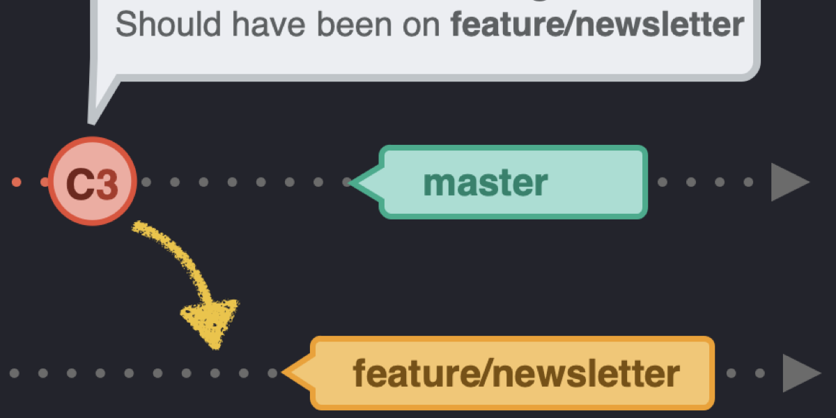
In part 5 of this series, we looked at rebasing and merging. Although there are a couple of differences between git merge and git rebase, both commands have the same goal: they integrate changes from one branch into another.
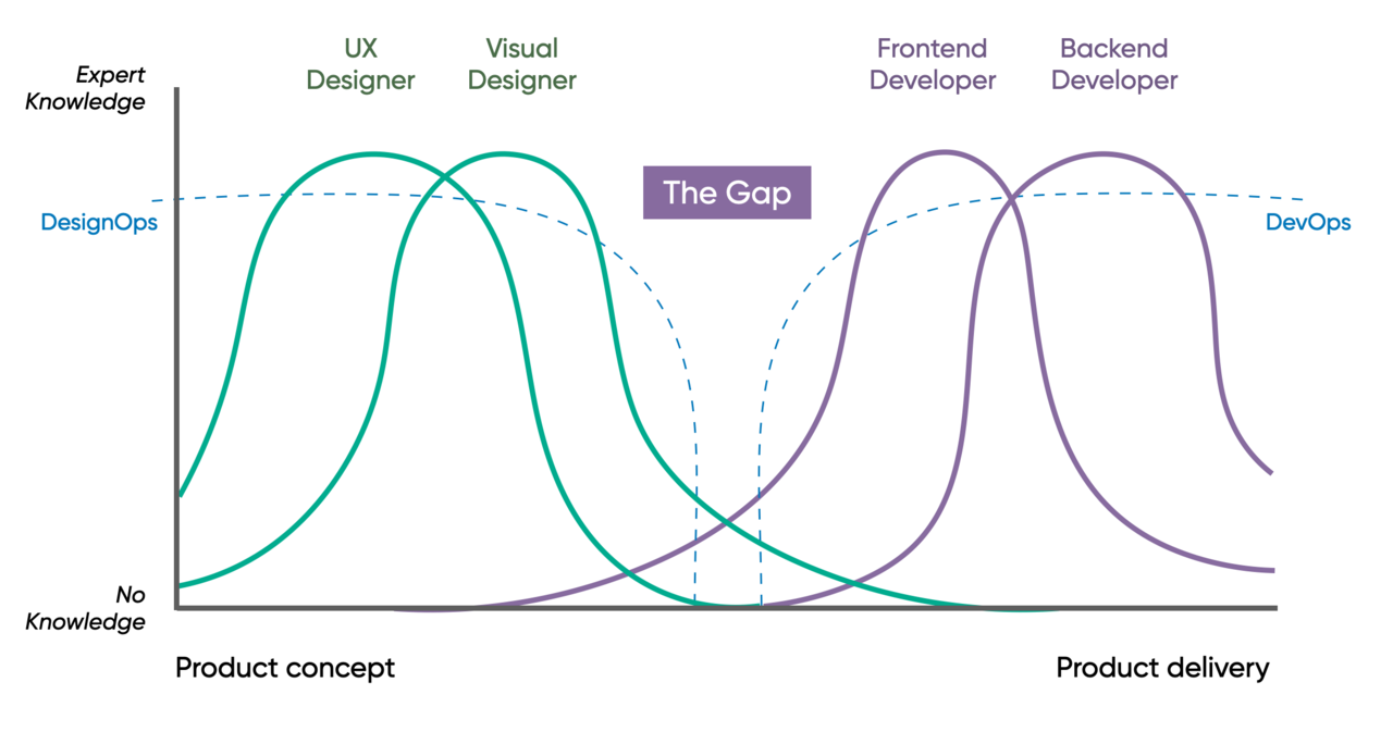
Egor Kloos describes a situation where a (purely visual) designer asks for some changes to a component. There is a misunderstanding where the (code monkey) developer implements the change exactly as requested—but really what was required was both a bug fix and a new variation to the component. Because of the skill siloing: problems.
Upon hearing “sticky footer” these days, I would think most people imagine a position: sticky situation where a footer element appears fixed on the screen while in the scrolling context of some parent element. That’s not quite what I’m talking about here. “Sticky footers” were a UI concept before position: sticky existed and they mean …
Mary Dyson produces nitty gritty research on the long-accepted notion that shorter line lengths are more legible than longer ones. The study finds that shorter lines do not necessarily lead to faster reading. If you’re looking for a definitive answer to use in your next design review debate, though, no dice. The big finding is …
Jamstack has been in the website world for years. Static Site Generators (SSGs) — which often have content that lives right within a GitHub repo itself — are a big part of that story. That opens up the idea of having contributors that can open pull requests to add, change, or edit content. Very useful!