These are a few great links about typography that have been burning a hole in my saved bookmarks folder that I’m just now getting around to sharing. There’s good stuff in there, from how to choose typefaces for app design to ideas for how to fix the concept of font sizing in CSS.
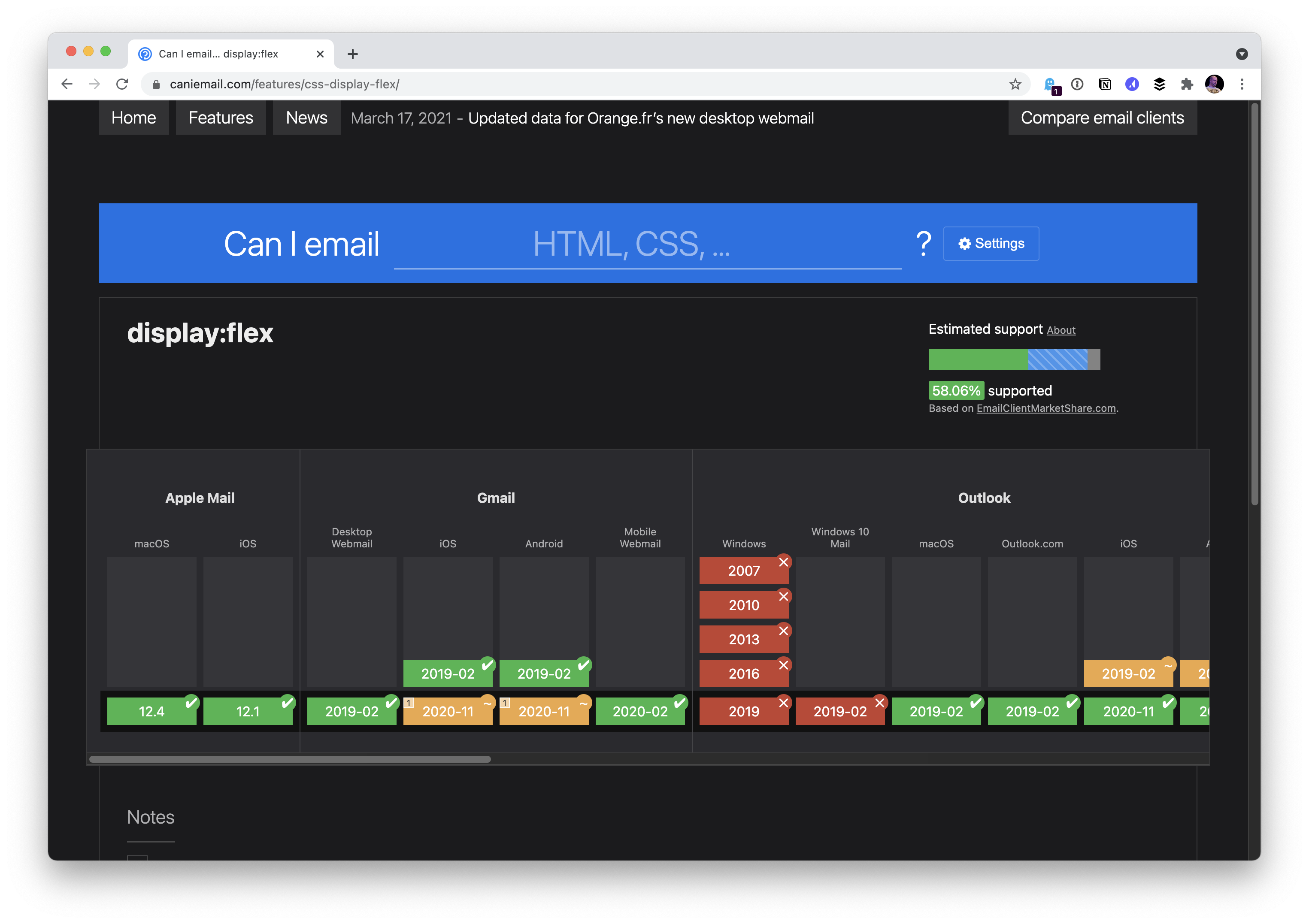
While I’m 85% certain you’ve seen and used Can I Use…, I bet there is only a 13% chance that you’ve seen and used Can I Email…. It’s the same vibe—detailed support information for web platform features—except instead of support information for web browsers, it is email clients. Campaign Monitor has maintained a guide for …
Route53 is DNS management service by AWS. DNS is absolutely not a database, and yet here’s Nicholas Martin writing up some very clever trickery originally done by Corey Quinn: When you think about it, DNS configuration is actually a very rudimentary NoSQL database. You can view and modify it at any time quite easily through …
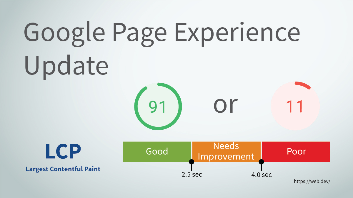
It’s easy to forget that, as a search engine, Google doesn’t just compare keywords to generate search results. Google knows that if people don’t enjoy their experience on a web page, they won’t stay on the page long enough to consume the content — no matter how relevant it is. As a result, Google has …
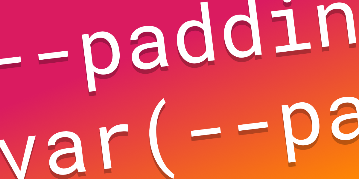
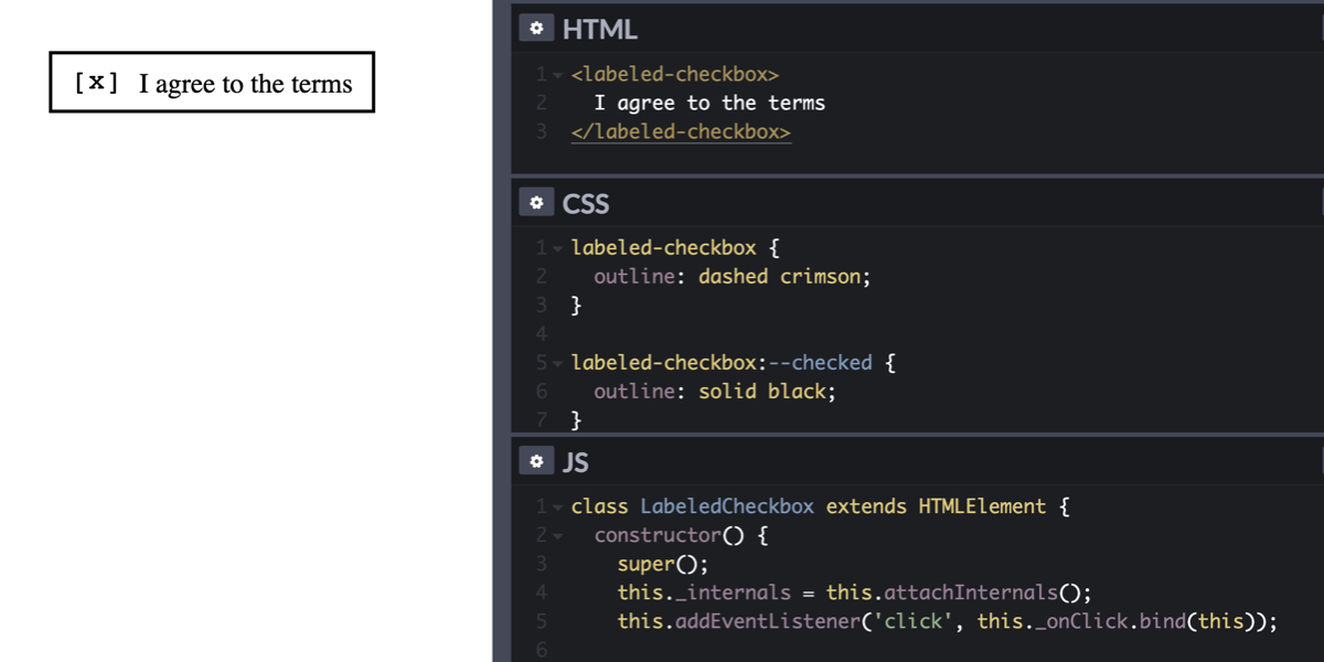
There is an increasing number of “custom” features on the web platform. We have custom properties (–my-property), custom elements (<my-element>), and custom events (new CustomEvent(‘myEvent’)). At one point, we might even get custom media queries (@media (–my-media)). But that’s not all! You might have missed it because it wasn’t mentioned in Google’s “New in Chrome …
You can’t even look at code or documentation for Astro (publicly) yet — it’s an in-progress idea — but you can watch a video of Fred showing it off to Feross. I gotta admit: it looks awesome. I’m bullish on two major parts of this:
The bombshell article of the week is from Alex Russell of Google/Chrome. Alex has long been super critical of Apple, particularly about how there is literally no option to run any other browser than Safari on iOS. This article isn’t just fist-waving about that, but a dissertation accusing Apple of real harm to the web …
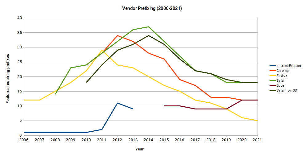
Let‘s take a quick stroll down memory-lane to revisit how vendor prefixing CSS properties came to be. I hope I don’t trigger PTSD for anyone! It‘s not clear who started prefixing, or when it began exactly. What is clear, is that by 2006, prefixed features were in Internet Explorer and Firefox. The raison d’être of …
This was a great “Today I Learned” for me from Josh W. Comeau. If the font-size of an <input> is 16px or larger, Safari on iOS will focus into the input normally. But as soon as the font-size is 15px or less, the viewport will zoom into that input. Presumably, because it considers that type …
Here’s a dilemma: what happens if your WooCommerce site has a problem and the quickest and best way to fix it is to roll back to a previous version? The dilemma is, if you roll back the database, you would lose literal customer orders that are stored in the database. That’s not acceptable for an …
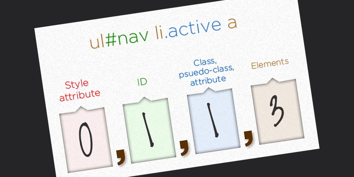
I was just chatting with Eric Meyer the other day and I remembered an Eric Meyer story from my formative years. I wrote a blog post about CSS specificity, and Eric took the time to point out the misleading nature of it (I remember scurrying to update it). What was so misleading? The way I …
A bona fide CSS trick from Kirupa Chinnathambi here. To match a colored shadow with the colors in the background-image of an element, you inherit the background in a pseudo-element, kick it behind the original, then blur and filter it.
In June of 2006, web developers and designers from around the world came to London for the second annual @media conference. The first had been a huge success, and @media 2006 had even more promise. Its speaker lineup was pulled from some of the most exciting and energetic voices in the web design and browser …
I hope people think of SVG as a vector format that is good for drawing things. There is plenty more to know, but here’s one more: SVG is good for composition. You draw things at very specific coordinates in SVG and, while they can scale, they tend to stay put. And while SVG is a …
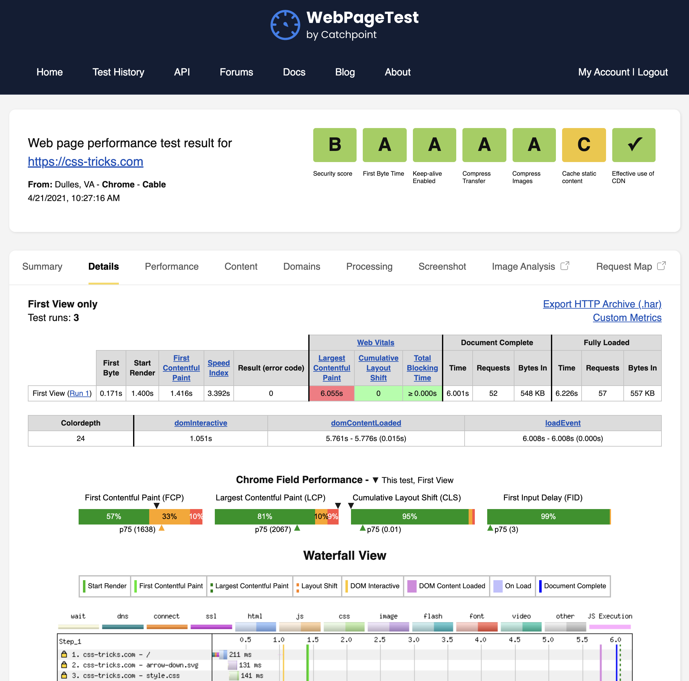
I’m willing to bet you know WebPageTest. It is the premier tool in the toolbox of web performance people. Maybe you didn’t know that WebPageTest was a side project of one fella, Patrick Meenan, for most of its lifetime, with literal racks of real devices he maintained himself. An amazing achievement, to be sure, but …
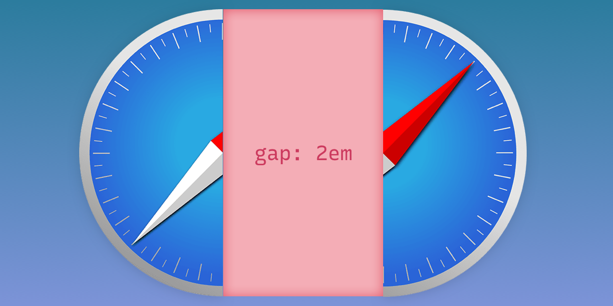
Yay, it’s here! Safari 14.1 reportedly adds support for the gap property in flexbox layouts. We’ve had grid-gap support for some time, but true to its name, it’s limited to grid layouts. Now we can use gap in either type of layout:
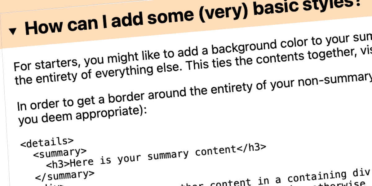
Jim Nielsen quoting Eric Bailey: He references an example on Twitter where someone noted you can use the <details> element to “create a native HTML accordion,” to which someone responded: “this works without Bootstrap? 🤯” What’s the problem here? From Eric: the problem that arises from this situation is that it teaches people to think …
Jenny B Kowalski has been posting a-letter-a-day on Instagram exploring multi-axis variable/responsive letterforms. They are very clever in that one of the axes controls an uppercase-to-lowercase conversion, literally morphing the shape of the letters from an uppercase version to a lowercase version. The other axis is a stroke weight, which also dramatically changes the feel …
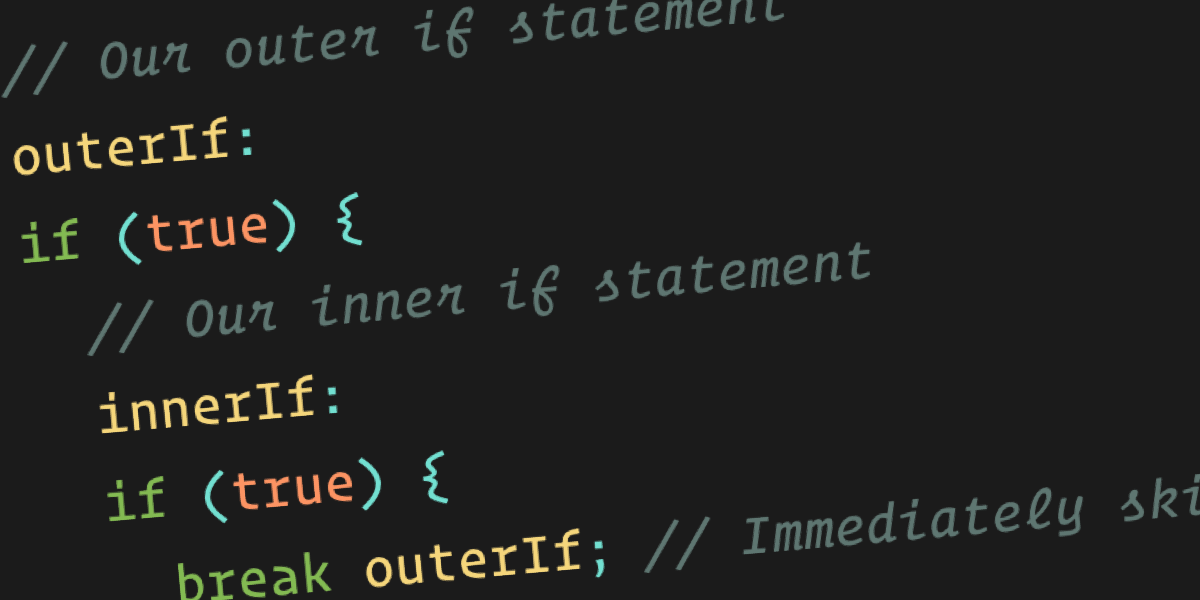
Labels are a feature that have existed since the creation of JavaScript. They aren’t new! I don’t think all that many people know about them and I’d even argue they are a bit confusing. But, as we’ll see, labels can be useful in very specific instances. But first: A JavaScript label should not be confused …
I’ve got a podcast that will be 10 years old this coming January! Most of those episodes have one or more guests (plus me and Dave). Despite fancy modern options for recording podcasts with guests, like Riverside.fm or Zencastr where guests don’t have to worry about recording their own audio, we haven’t made the leap …
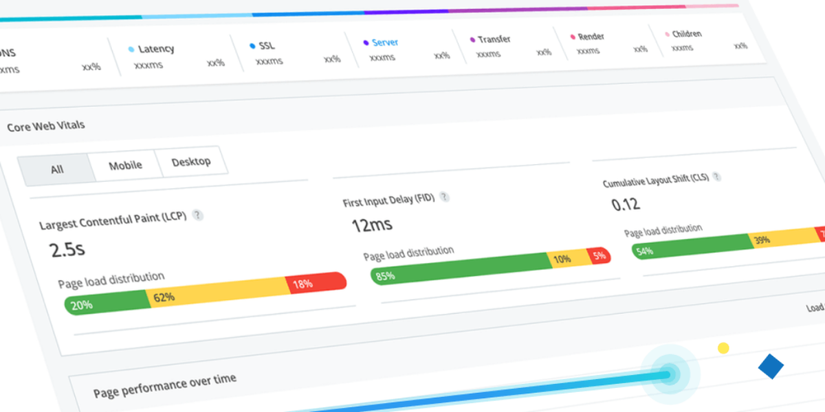
Raygun is an error and performance monitoring software for websites and mobile apps. In the case of websites, you install their JavaScript snippet onto your site, which takes 2 seconds, and now you’ve got monitoring in place. Why? Well now you can watch the performance of your site, not just in a single report of …
Šta su git submoduli? Submoduli su projekti (najčešće neke biblioteke) koji su ubačeni u neki drugi projekat, nakon čega su u tom tzv. “glavnom” projektu dostupni svi fajlovi submodula. Git subdmoduli nam omogućavaju da koristimo dva ili više repozitorijuma kao da su jedno. Svaki repozitorijum održava svoju zasebnu istoriju promena pa se čak subdmoduli ažuriraju …
Lists—we’ve all worked with them in one form or another. I’m talking about HTML’s <ol> and <ul>. Much of the time, because we desire styling control, we turn off the list’s markers completely with list-style-type: none, and start styling from there. Other times, we choose from a very limited set of unordered list markers, such …
This post was written for engineering managers, but anyone is welcome to read it. Let’s talk for a moment about how we talk about our teams. This might not seem like something that needs a whole article dedicated to it, but it’s actually quite crucial. The way that we refer to our teams sends signals: …
Click, drag, release: you’ve just selected some text on a webpage — probably to copy and paste it somewhere or to share it. Wouldn’t it be cool if selecting that text revealed some options that make those tasks easier? That’s what a selection menu does. You may already be familiar with selection menus if you’ve ever used …
I was just Hoping for Better Native Page Transitions, and Bramus commented that Chrome is working on something. Looks like it has some fresh enthusiasm for it, as there is a brand new repo, and you can literally test it in Chrome Canary.
Everything important and useful to know about CSS Custom Properties. Like that they are often referred to as “CSS Variables” but that’s not their real name.
I saw in the release notes for Safari Technical Preview 122 that it has support for a color-contrast() function in CSS. Safari is first out of the gate here. As far as I know, no other browser supports this yet and I have no idea when stable Safari will ship it, or if any other …
I love to make CSS do stuff it shouldn’t. It’s the type of problem-solving brain training you’d get building a calculator in Minecraft, except you probably won’t get a job working with Minecraft Redstone no matter how good you get at that, whereas CSS skills are worth actual money, and many generalist programmers are scared …
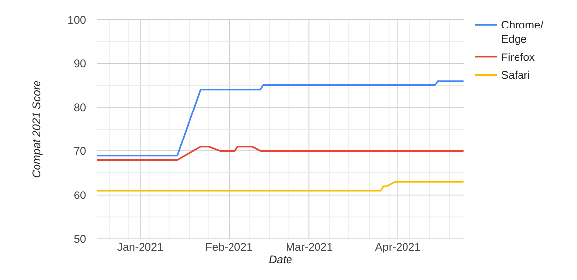
Robert Nyman and Philip Jägenstedt: Google is working with other browser vendors and industry partners to fix the top five browser compatibility pain points for web developers. The areas of focus are CSS Flexbox, CSS Grid, position: sticky, aspect-ratio, and CSS transforms. … The goal in 2021 is to eliminate browser compatibility problems in five key focus …

 css-tricks.com


 webprogramiranje.org