+ Follow
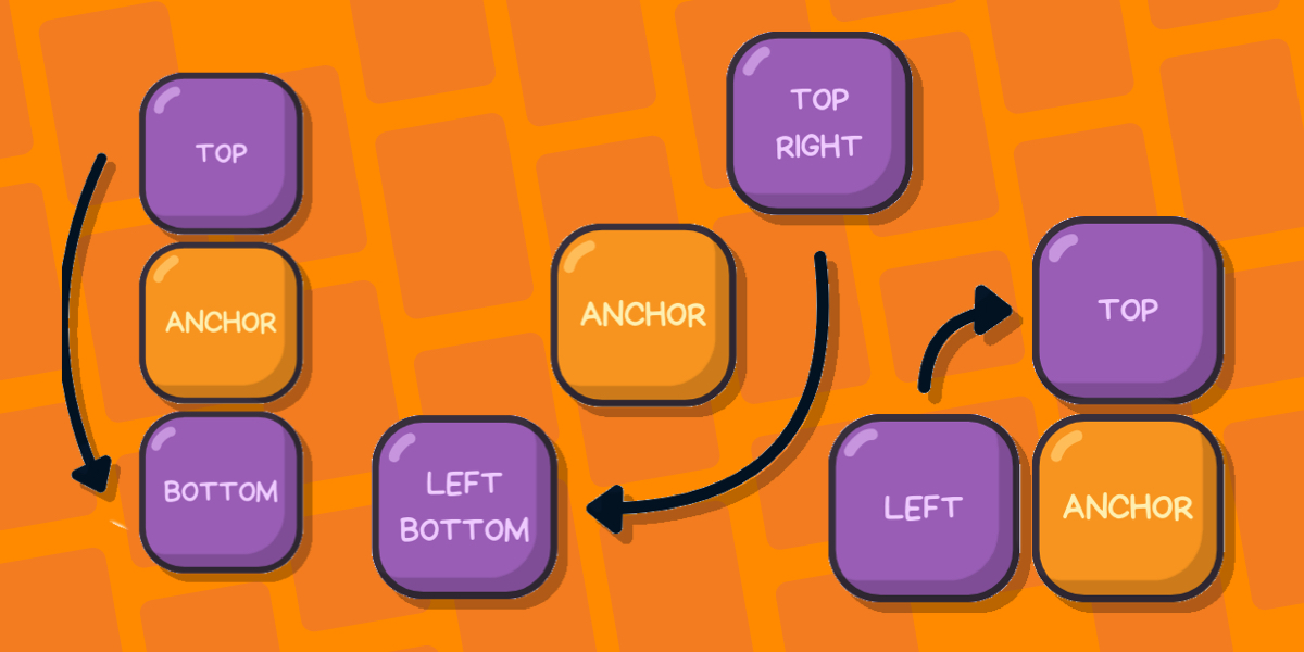
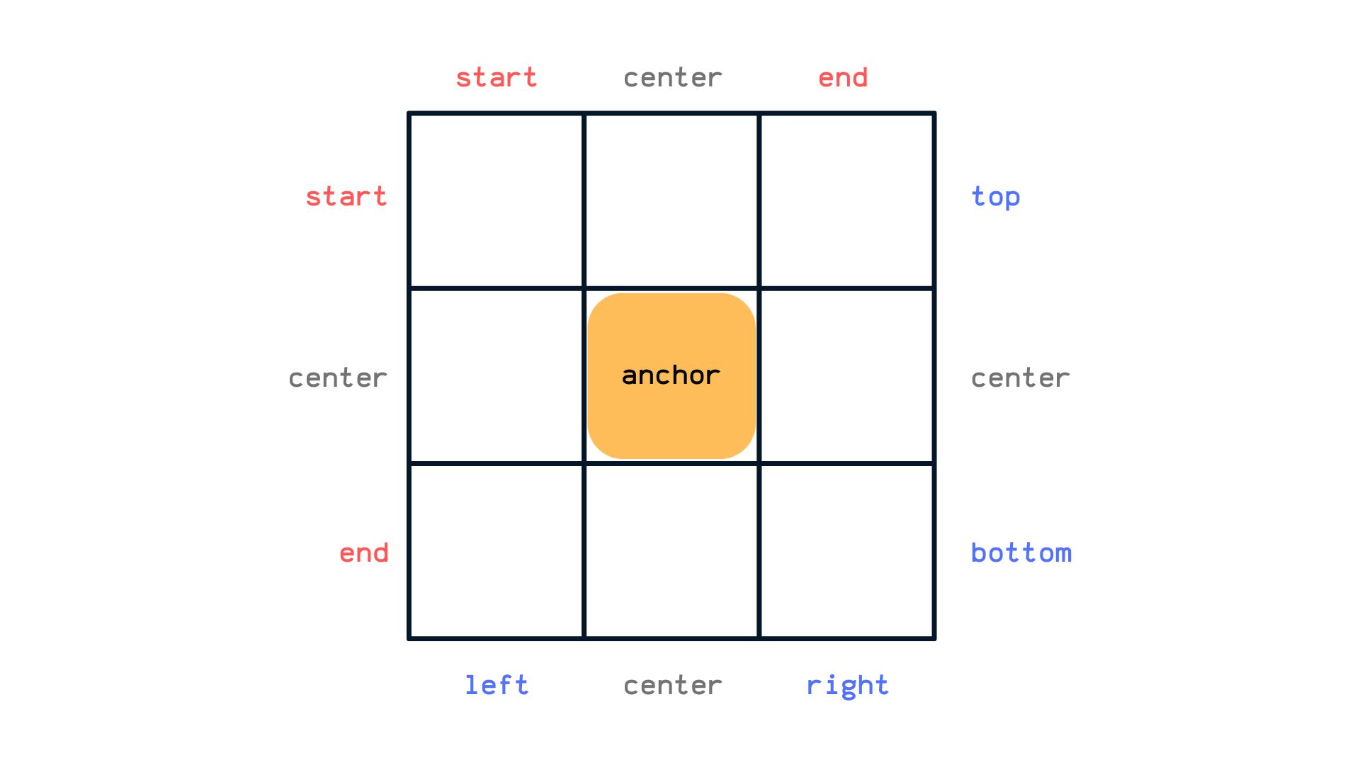
CSS Anchor Positioning Guide
Learn about CSS Anchor Positioning, including its syntax, properties, how it is used to position one element next to another, and even how it’s used to resize elements relative to other elements.
Web Development
+ Follow
The selectmenu Element is No More…Long Live select!
I was looking over an older article Patrick Brosset penned for us introducing <selectmenu>, a new proposal at the time …
Web Development
+ Follow
Quick Hit #21
Seeing a lot more headlines decrying JavaScript and pumping up PHP. Always interesting to see which direction the front-end zeitgeist …
Web Development
+ Follow
CSSWG Minutes Telecon (2024-09-18)
For the past two months, all my livelihood has gone towards reading, researching, understanding, writing, and editing about Anchor Positioning, …
Web Development
+ Follow
Quick Hit #20
Having fun with Bramus’ new Caniuse CLI tool. This’ll save lots of trips to the Caniuse site!
Web Development
+ Follow
Quick Hit #19
Two possible syntaxes for CSS masonry, one draft specification, and you get to share your opinions.
Web Development
+ Follow
Re-Working the CSS Almanac
Getting right to it: the CSS-Tricks Almanac got a big refresh this week! I’m guessing you’re already familiar with this …
Web Development
+ Follow
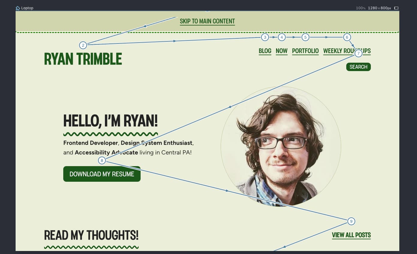
Clever Polypane Debugging Features I’m Loving
I’m working on a refresh of my personal website, what I’m calling the HD remaster. Well, I wouldn’t call it …
Web Development
+ Follow
Multiple Anchors
Only Chris, right? You’ll want to view this in a Chromium browser: This is exactly the sort of thing I …
Web Development
+ Follow
Smashing Hour With Lynn Fisher
I’m a big Lynn Fisher fan. You probably are, too, if you’re reading this. Or maybe you’re reading her name …
Web Development
+ Follow
Two CSS Properties for Trimming Text Box Whitespace
The text-box-trim and text-box-edge properties in CSS enable developers to trim specifiable amounts of the whitespace that appear above the first formatted line …
Web Development
+ Follow
What’s Old is New
I collect a bunch of links in a bookmarks folder. These are things I fully intend to read, and I …
Web Development
+ Follow
Two Ways to Create Custom Translated Messaging for HTML Forms
HTML forms come with built-in ways to validate form inputs and other controls against predefined rules such as making an …
Web Development
+ Follow
Quick Hit #18
PSA: Today’s the day that Google’s performance tools officially stops supporting the First Input Delay (FID) metric that was replaced …
Web Development
+ Follow
Anchor Positioning Quirks
I am thrilled to say, that from this week onwards, the CSS-tricks Almanac has an entry for each property, function, …
Web Development
+ Follow
Sanding UI
Jim hit a snag while working on a form. Placing labels next to inputs is trivial with flexbox, sure, but …
Web Development
+ Follow
Time Travelling CSS With :target
Checkbox and radio button hacks are the (in)famous trick for creating games using just CSS. But it turns out that other elements based on user input …
Web Development
+ Follow
Sticky Headers And Full-Height Elements: A Tricky Combination
Quite a fun article I worked on with Philip Braunen. Do you know that little bit of elasticity you get …
Web Development
+ Follow
Quick Hit #17
“Wrapping the <label> around the <input> is fine, and is sufficient for conformance on its own, however adding explicit association …
Web Development
+ Follow
Quick Hit #16
“Never, ever hire for JavaScript framework skills. Instead, interview and hire only for fundamentals like web standards, accessibility, modern CSS, …
Web Development
+ Follow
Quick Hit #15
Almost missed that the WP Twenty Twenty-Five theme was approved a couple weeks ago.
Web Development
+ Follow
Quick Hit #14
Inclusive Design 24 is in 8 short days — and it’s FREE, no sign-up required!
Web Development
+ Follow
Another Stab at Truncated Text
Seems like we’re always talking about clipping text around here. All it takes is a little browsing to spot a …
Web Development
+ Follow
CSSWG Minutes Telecon (2024-08-21)
View Transitions are one of the most awesome features CSS has shipped in recent times. Its title is self-explanatory: transitions …
Web Development
+ Follow
Paragraphs
I sure do love little reminders about HTML semantics, particularly semantics that are tougher to commit to memory. Scott has …
Web Development
+ Follow
Shipping Tumblr and WordPress
Didya see that Tumblr is getting a WordPress makeover? And it’s not a trivial move: This won’t be easy. Tumblr …
Web Development
+ Follow
The “Other” C in CSS
I think it’s worth listening to anything Sara Soueidan has to say. That’s especially true if she’s speaking at an …
Web Development
+ Follow
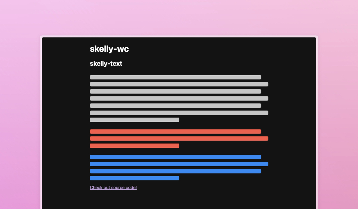
Introducing <skelly-wc>
I created a little library at work to make those “skeleton screens” that I’m not sure anyone likes. … We …
Web Development
+ Follow
Useful Tools for Creating AVIF Images
AVIF (AV1 Image File Format) is a modern image file format specification for storing images that offer a much more …
Web Development
+ Follow
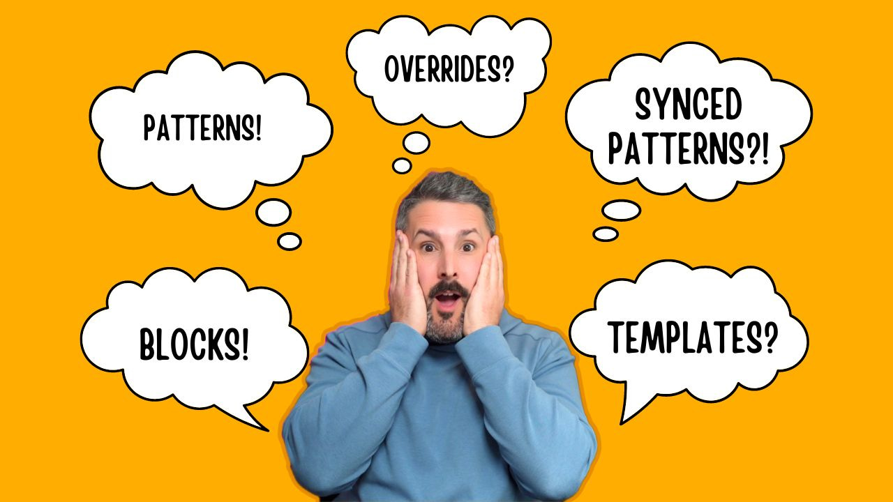
Understanding Gutenberg Blocks, Patterns, and Templates
Developers suffer in the great multitudes whom their sacred block-based websites cannot reach. Johannes Gutenberg (probably) Long time WordPresser, first …
Web Development
![]() css-tricks.com
css-tricks.com
